Work in progress:
I'm completing the design and documentation, but the final content is still under review.

BASECAMP | Camping Supply Store
My Role
UX/UI Designer, UX Researcher
Timeline
10 September 2025 - Present
Team
Solo Designer
Sector
e-commerce
Capstone project for
Google UX Design Certification
Challenge
As a part of my Google UX Certification, I had to design a responsive website for a camping supply store to advertise and sell its products. I had the freedom to choose this problem statement.
I chose this prompt because e-commerce websites for niche markets like camping supplies often struggle with clear product discovery and smooth online transactions. Designing a solution for this felt both challenging and exciting, especially since it required balancing usability, responsiveness, and accessibility.
Solution
I designed a responsive camping supply website that allows users to:
Browse and explore products through clear categorization and visuals
Create an account for a personalized experience
Add products to their cart and complete secure purchases
The final design focused on accessibility, simple navigation, and trust-building elements, ensuring a seamless shopping journey across devices.
Research
To ensure the Basecamp website effectively serves a diverse camping community, the initial Research Phase focused on understanding the core needs and current frustrations of various camper types. The primary objective was to uncover critical insights related to product comparison, affordability, family-friendly curation, and checkout trust. This foundational work involved deep empathetic understanding necessary to design a platform where users can make confident, informed, and safe gear choices.
Building Empathy: Empathy Maps and Pain Points
We began by creating Empathy Maps for our core user types. This exercise synthesized our initial observations, illuminating their specific thoughts, feelings, and actions related to online gear shopping. Moving beyond assumptions, this step helped ground the design in user reality.


An example of an Empathy Map, detailing the thoughts, feelings, actions, and sayings of a target user segment.
Analysis of these maps and foundational user stories led to the crystallization of several key User Pain Points. These highlighted critical frustrations that the new Basecamp platform needed to address:
Overwhelming Comparison: Difficulty comparing specs across too many options, causing frustration for experienced users like Raghav.
Safety vs. Budget Stress: The high anxiety around finding safe, reliable, and affordable gear bundles for budget-conscious students like Ananya.
Information Overload: The overwhelming nature of selecting appropriate, easy-to-use gear for children, a challenge for parents like Meera.
Visualizing Friction: User Journey Maps
Finally, User Journey Maps were created to visualize the complete, end-to-end experience of each persona attempting to achieve their goals on a typical camping gear website. These maps were instrumental in identifying specific moments of friction and key opportunities for design intervention—for instance, high frustration during the detailed product review phase and anxiety during the final, often unclear, checkout process.
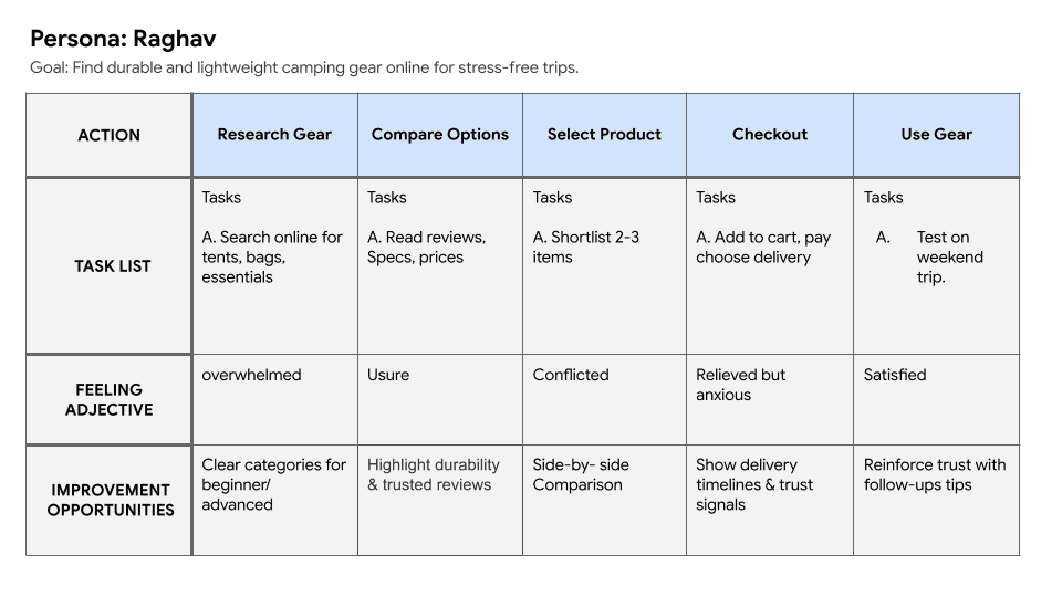
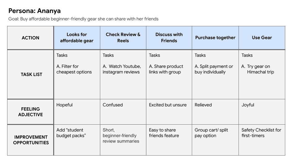

A User Journey Map illustrating a typical path for a family-oriented beginner camper, highlighting emotional highs and lows, and key touchpoints.
Define Phase: Framing the Problem and Strategy
The Define Phase focused on synthesizing the insights gathered in the research phase into a clear, actionable strategy. We framed the problem by formally defining our target users, articulating specific feature requirements, and establishing measurable goals for success.
Defining the Audience: User Personas and Stories
The research established the foundation for three detailed User Personas: Raghav (Experienced Camper), Ananya (Budget-Conscious Student), and Meera (Family-Oriented Beginner). Each persona represents a crucial audience segment, ensuring solutions address their unique needs for durability, affordability, and curation, respectively.
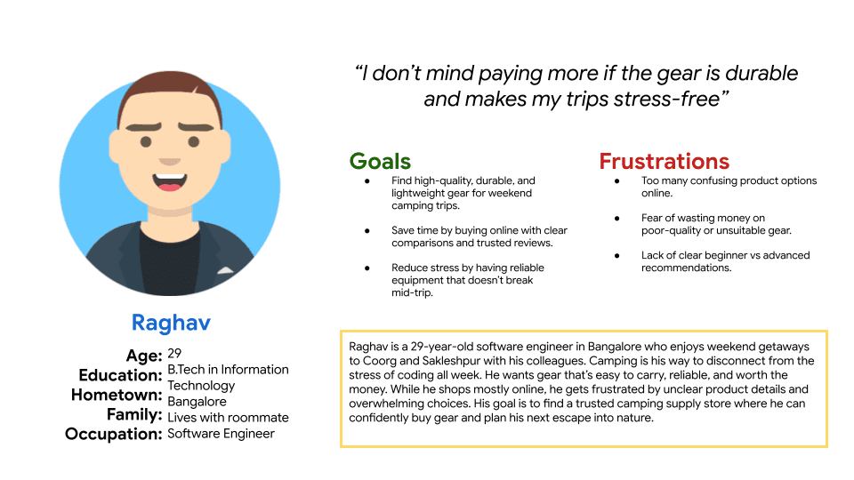
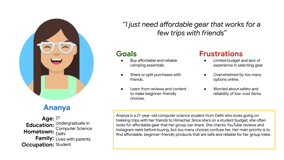
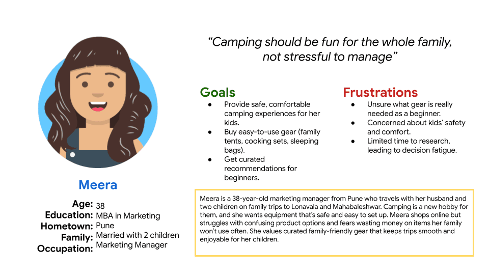
Visual representations of the three core User Personas: Raghav, Ananya, and Meera, summarizing their key traits, needs, and goals.
Based on these personas, User Stories were developed to translate high-level needs into concise, actionable goals for the product. These stories served as a checklist for defining specific features and ensuring the final design directly addresses each persona's critical requirements.

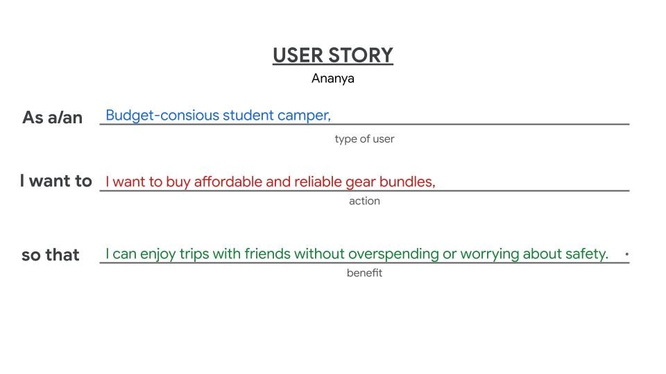
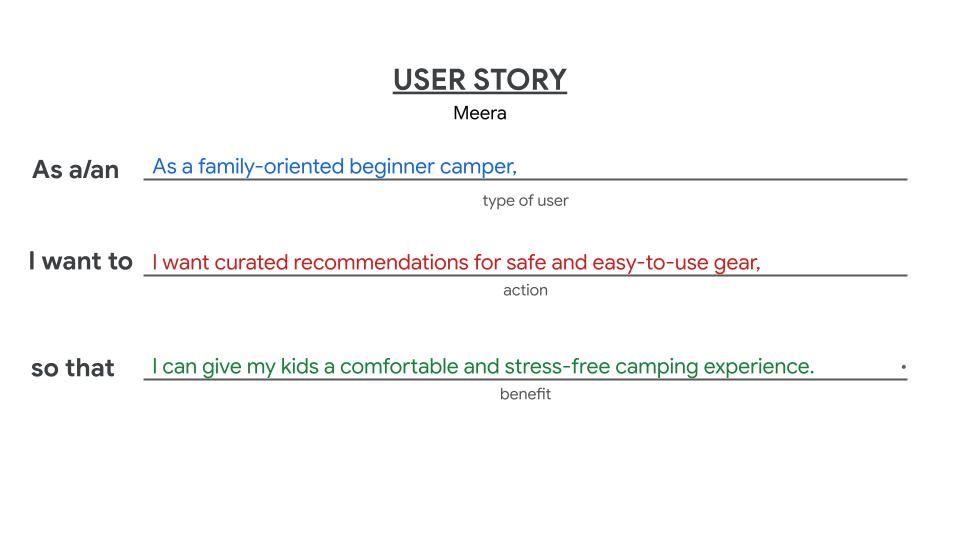
A collection of User Stories, demonstrating how user needs are translated into actionable, user-centric requirements for the Basecamp platform.
Strategic Alignment: Problem Statements
The core challenges identified were distilled into clear, actionable Problem Statements. These statements provided a definitive scope for the design phase, establishing the specific problems we aimed to solve:
Raghav needs durable, lightweight gear with clear comparisons because he is frustrated with unclear product details and too many confusing online options.
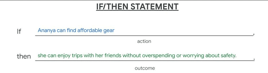
Ananya needs affordable and reliable camping gear bundles because she is budget-conscious and wants to enjoy safe trips without worrying about safety.
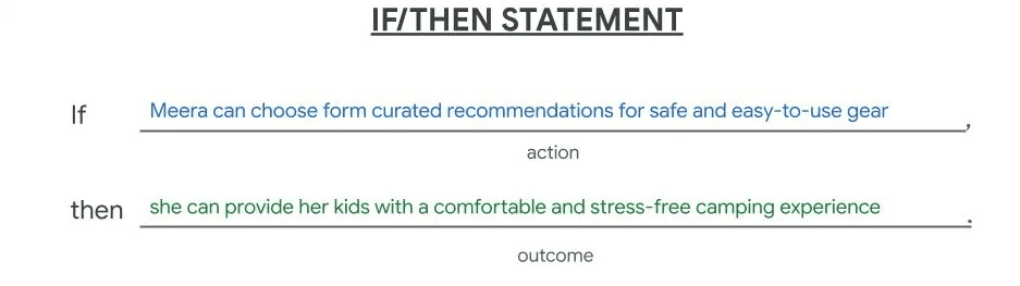
Meera needs curated recommendations for safe and easy-to-use gear to provide her kids with a comfortable and stress-free camping experience.
Formulating the Solution: Hypothesis Statements
We created Hypothesis Statements to frame our assumptions about the design solution using an If/Then logic structure. This approach clearly defined what we planned to build and how we expected it to solve a user's problem, setting the stage for future testing and validation.
We believe that offering a visual "Comparison Mode" for experienced campers will increase their decision-making speed because it addresses their frustration with unclear, scattered product data.
We believe that creating a prominent "Family Gear" section with curated recommendations for parents like Meera will lead to higher family kit sales because it alleviates their anxiety about choosing safe, appropriate gear for children.
We believe that ensuring a clear, secure checkout with visible policy links for all customers will reduce cart abandonment because it builds trust and reduces purchase anxiety.

A concise summary of the Hypothesis Statements, showing the clear "We believe...for...will...because..." structure that guides design assumptions.
Establishing Value: Value Proposition Brainstorming
To ensure the Basecamp platform provides a unique and compelling solution, we conducted a brainstorming session to define our Value Proposition. By mapping user Pains and Gains against our proposed Pain Relievers and Gain Creators, we solidified a clear strategy for delivering what users truly need—focusing the platform's core offering on confidence, convenience, and competitive pricing
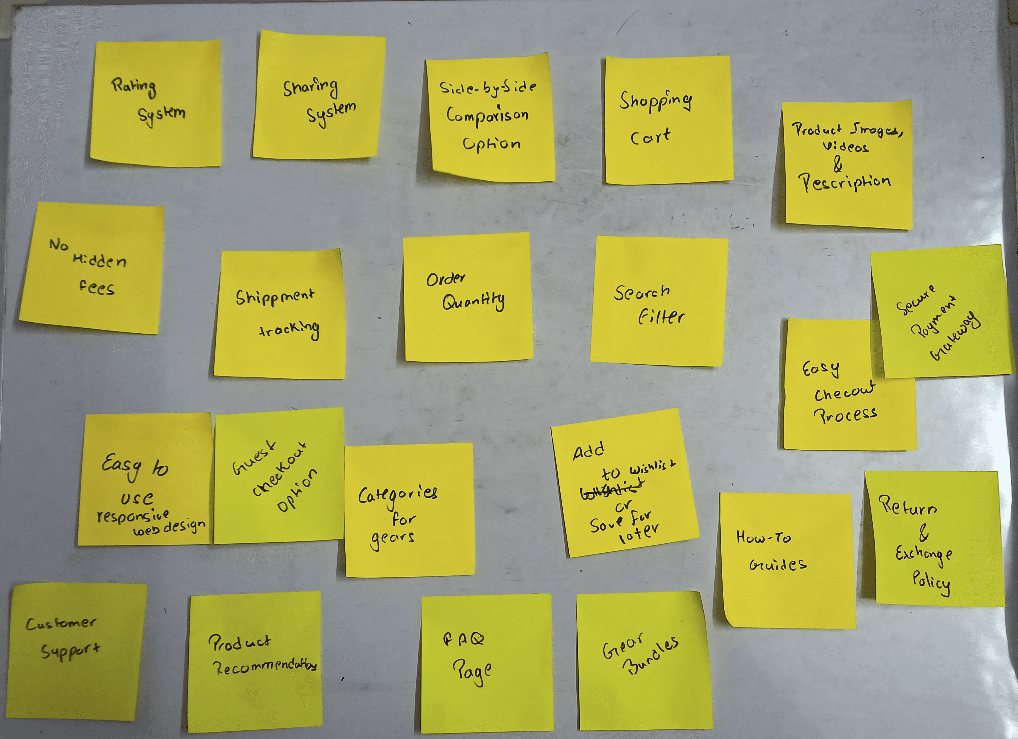
A photo of the sticky notes used during the Value Proposition brainstorming session, showing the raw process of aligning user needs with product features.
Ideation Phase: Strategy and Solution Building
The Ideation Phase translated the validated user problems and strategic objectives from the Define phase into tangible solutions. This step involved setting measurable goals, analyzing the competitive landscape, and visualizing key user flows through storyboards.
Setting the Target: Goal Statements
To provide a clear, measurable outcome for the project, we established specific Goal Statements that align directly with the primary objectives. These define the success metrics for the design solutions:
Product Confidence Goal: Increase the rate of successful product comparison and decision-making by 25%.
Affordability Goal: Ensure 90% of budget-conscious users can find and easily purchase a suitable gear bundle.
Trust Goal: Achieve a 95% completion rate in the secure checkout process.


A visual display of the key Goal Statements, including the measurable targets set for the Basecamp project.
Learning from the Landscape: Competitive Analysis
A Competitive Analysis was performed to understand the strengths and weaknesses of direct competitors (Decathlon, REI, and Amazon) across key areas like target audience, unique value propositions, and user experience (UX) elements. The insights gathered directly informed Basecamp's design strategy, helping to define our unique offering and avoid existing pitfalls.
Competitor
Target Audience/ UVP
Key UX Strenghts
Key UX Drawbacks
Decathlon
Students, families, budget adventurers; UVP: Affordable, durable gear (in-house brand)
Strong brand, Outstanding content clarity, welcoming UI.
Interaction experience needs engagement.
REI
Requires email/password to create an account (no social login), UI perceived as "old style."
Experienced enthusiasts, premium segment; UVP: Expert advice + premium curated gear
Clear branding, good navigation, concise content.
Amazon
Strong, consistent visual design, all information is present.
Feels dense and overwhelming, content is "too descriptive," needs negative space.
Mass audience, all segments; UVP: Convenience, widest selection, fast delivery
A visual display of the key Goal Statements, including the measurable targets set for the Basecamp project.
Competitive Insights Summary:
The analysis highlighted critical opportunities for Basecamp:
Affordability & Curation (Learned from Decathlon): Decathlon's success with affordability and strong content validates the need for Basecamp to clearly feature budget-friendly bundles for users like Ananya.
Streamlining Interaction (Learned from REI): REI's poor rating for account creation interaction confirmed the importance of ensuring a secure and easy checkout process, addressing the "Trust Goal."
Clarity and Simplicity (Learned from Amazon): Amazon's drawback of feeling "dense and overwhelming" emphasized the necessity for Basecamp to prioritize negative space, clarity, and intuitive navigation to achieve the "Product Confidence Goal" for users like Raghav.
Visualizing the Solution: Storyboarding
To visualize how the new platform would meet the user needs identified in the Define phase, Storyboards were created. Storyboards help communicate a user's emotional journey and the context of use, clearly illustrating how Basecamp's features—such as quick comparison tools or curated family bundles—would relieve specific pain points.

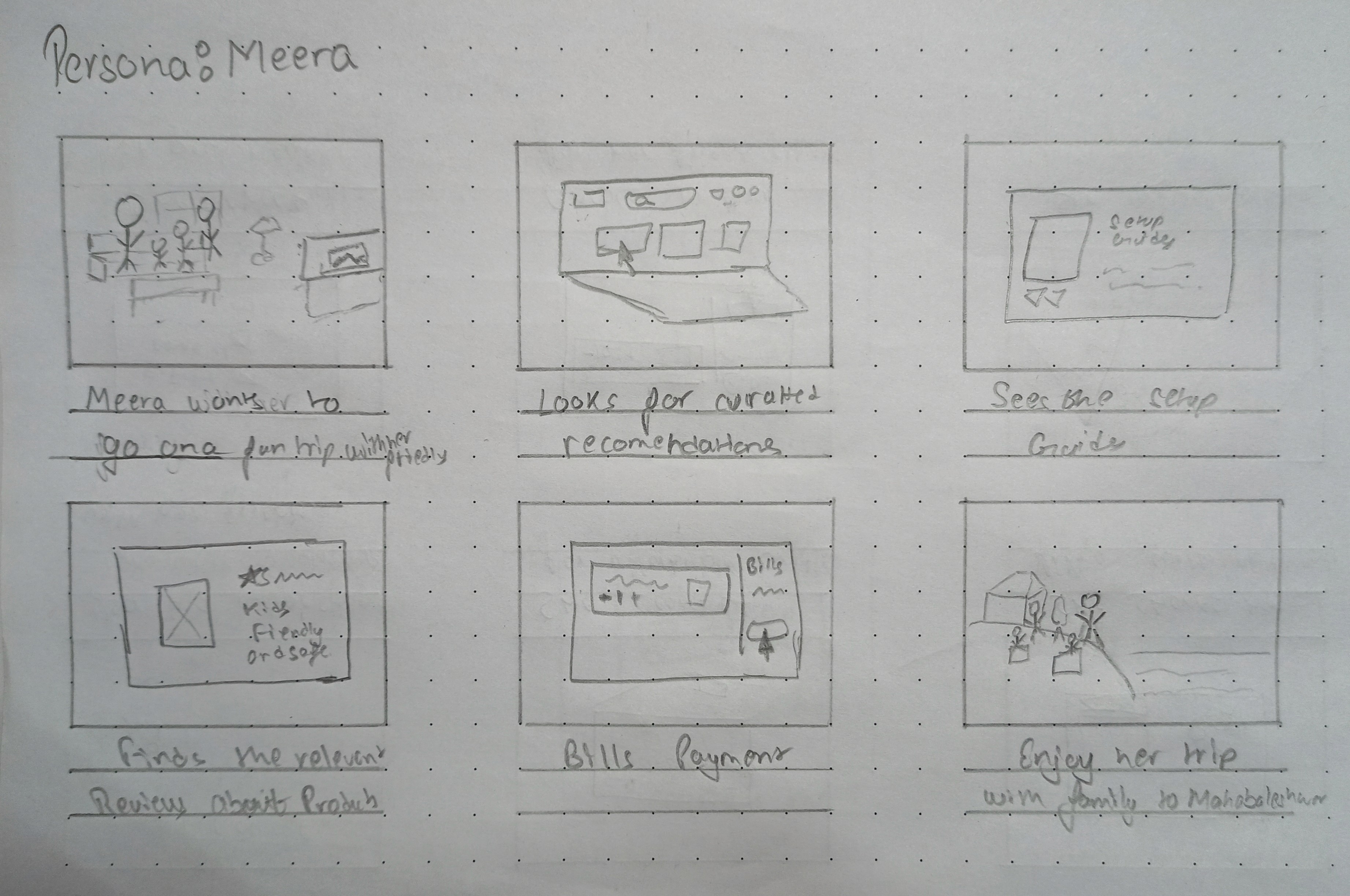

A storyboard sequence illustrating a persona (e.g., Meera) successfully finding, comparing, and confidently purchasing a family-friendly gear bundle on Basecamp.
Wireframing Phase: Structure and Blueprint
The Wireframing Phase focused on translating the defined user needs, strategic goals, and competitive insights into a functional structural blueprint for the Basecamp platform. This step established the core pathways, content hierarchy, and basic layout, prioritizing efficiency and usability before visual design.
Defining Pathways: User Flows
User Flows were created to map out the exact steps a user takes to complete key tasks identified in the research—specifically addressing the goals of product comparison (Raghav), finding affordable bundles (Ananya), and secure checkout (all users). This ensured that critical paths were intuitive, efficient, and free of the friction points identified in the initial journey maps.
Organizing Content: Information Architecture (IA)
The Information Architecture (IA) was developed to create a clear, logical, and user-friendly organization of the website's content. By defining the hierarchy and relationships between categories, we aimed to solve the problem of overwhelming navigation observed in competitors like Amazon. The IA prioritized:
Goal-Oriented Browsing: Categories focused on user needs (e.g., "Family Camping," "Budget Bundles") rather than just product types.
Comparison Ease: Placing detailed specifications and reviews logically within the product hierarchy to support confident decision-making (Raghav's need).
A diagram illustrating the Information Architecture (site map) for the Basecamp platform, showcasing the content hierarchy and navigation structure.
Building the Foundation: Wireframes
Wireframes served as the low-fidelity blueprints for the platform. Created digitally, these grayscale layouts focused purely on space allocation, content placement, functionality, and interaction, without the distraction of color or imagery.
Key Solutions Demonstrated:
Dedicated Comparison UI: Wireframes were used to sketch a clear, side-by-side comparison feature to meet Raghav's need for easy product evaluation.
Prominent Trust Elements: The checkout wireframes were designed to prominently display security badges and clear policy links to address the "Trust Goal."
Curation Access: Quick links and dedicated sections for curated, family-friendly bundles were prioritized to assist users like Meera.
These wireframes were essential in quickly testing and iterating on layout ideas before moving into the visual design phase.
Usability Study: Testing and Validation
Following the creation of the foundational wireframes, a Usability Study was conducted to test the core flows and structural integrity of the Basecamp design. The primary objective was to validate the key solutions designed to address product comparison, affordability, and secure checkout, using the target users (personas) as guides.
Gathering Feedback: User Testing Sessions
During the study, participants were asked to complete key tasks, such as comparing two specific gear items, locating a budget-friendly family bundle, and completing the checkout process. Throughout the sessions, qualitative data was collected, including observations, direct quotes, and immediate feedback, which was then synthesized.
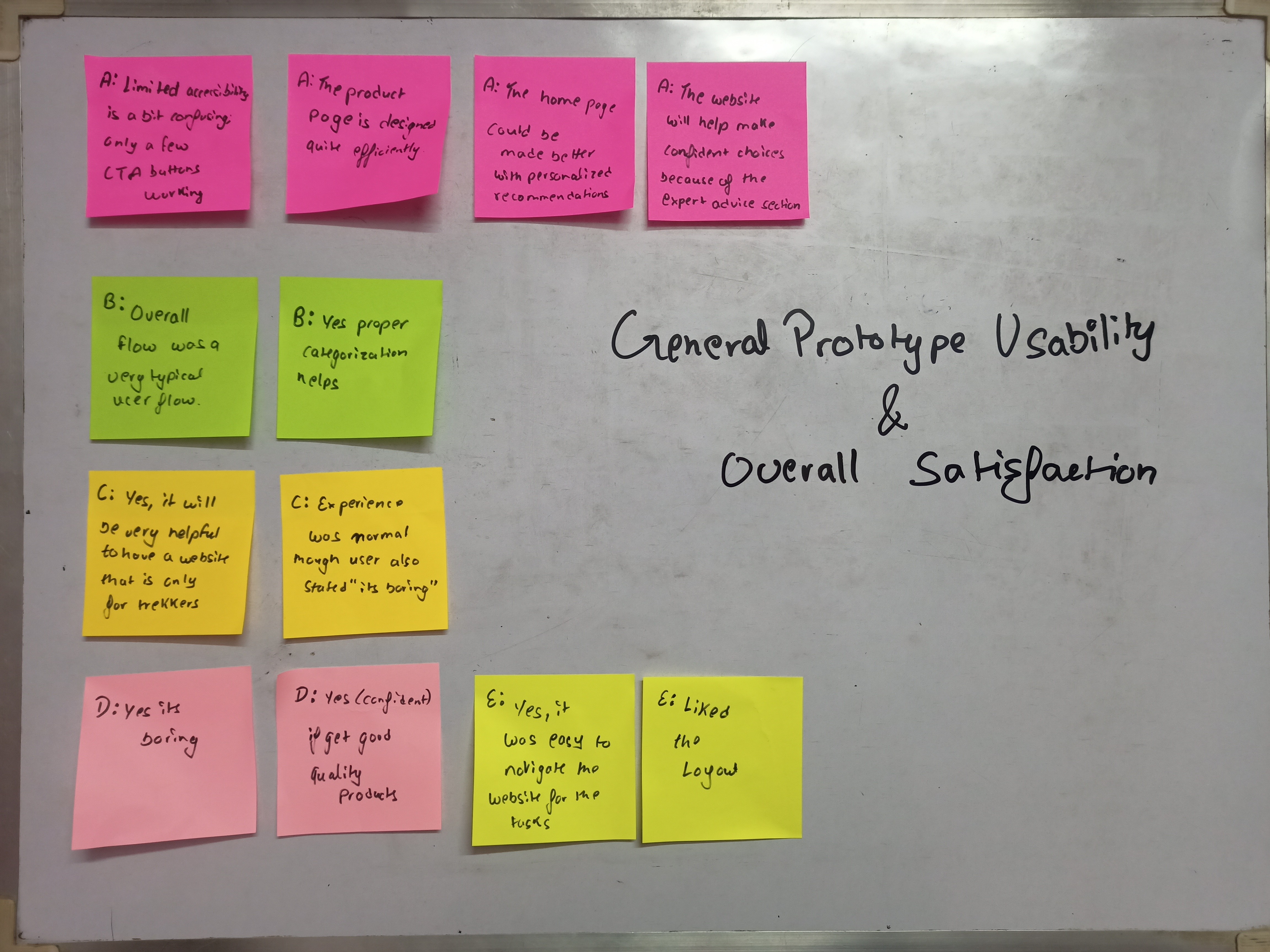


A photo of sticky notes capturing raw user feedback, observations, and quotes collected during the usability testing sessions.
Synthesis: Pattern Identification and Insights
After the testing sessions, the raw user feedback was analyzed through Pattern Identification. By grouping similar comments, identifying recurring pain points, and noting common areas of confusion, we were able to distil the raw data into actionable Insights that directly informed the subsequent high-fidelity design phase.
Key Patterns Identified:
• Can't Find Cheapest Options: Budget-focused users found it difficult or impossible to filter the product listing specifically for the cheapest available items or budget-friendly gear.
• Curated Kits Are Hidden: New campers (like family beginners) could not locate "family starter kits" or curated gear recommendations easily on the website.
• Lack of Details: Users requested more proper descriptions and specifications for products displayed.
• Homepage is Generic: The home page was criticized for lacking personalized gear recommendations
Actionable Insights:
The patterns led to critical design insights:
Highlight Bundles: Create and clearly promote affordable bundles, potentially as "student budget packs," to address budget concerns.
Expand product descriptions to specifically emphasize attributes important to new parents, such as kid-safety, ease-of-setup, and comfort
Feature Kits Prominently: Place curated recommendations (like "Family Starter Kits") directly on the landing page to make them easier to find
Building the Final Product: High-Fidelity Design
The Design Phase built upon the validated structure from the Usability Study, transforming the low-fidelity wireframes into polished, high-fidelity mockups. This phase established the visual language of the Basecamp brand and executed the design adjustments required by user feedback.
Establishing Visual Consistency: Design System
A foundational Design System (or Style Guide) was developed to ensure visual consistency, accessibility, and efficiency throughout the platform. Every element—from color choices to typography—was selected to reflect the brand's core values of Trust, Approachability, and Durability, while supporting the functional goals established in the Define phase.
Color Palette: A calming base palette (e.g., natural greens and earth tones) was chosen to evoke the outdoors and establish a welcoming atmosphere for new campers like Meera, complemented by a high-contrast accent color to draw attention to key interactive elements (like comparison buttons and checkout calls-to-action).
Typography: Clear, highly readable fonts were selected to improve scannability, directly addressing the pain point of "overwhelming content" noted in the competitive analysis (Amazon).
Component Library: Reusable components (buttons, cards, navigation bars, and form fields) were created to ensure a consistent experience across all devices and pages, particularly simplifying the interaction patterns for the secure checkout.
A visual display of the key elements of the Basecamp Design System, including the color palette, typography hierarchy, and a few essential UI components (buttons, input fields)